We have a new, bold branding to better show what reachaut keeps on doing since 2020: guide US communities abroad in their journey to health
Health is a journey, an ongoing process. And this has always been our commitment, here at reach aut: give all the tools people need to follow the right path in our continuous effort to take care of our mental and physical well-being.
Since its conception, reach aut promoted an all-round definition of “health”, that views our mind and psyche as the foundation of a satisfying, independent and fulfilling life. Healing starts from the inside, and it’s a human need common to everyone: everybody wants to feel better, and what it takes is often just a small nudge in the right direction.
This is what reach aut is and will always be: a group of dedicated health professionals that will stay at your side in this journey, and will use their knowledge and scientific approach to clear the path for you.
To communicate this reinforced vision in a clearer, more straight-forward way we worked on a new image and a new branding.
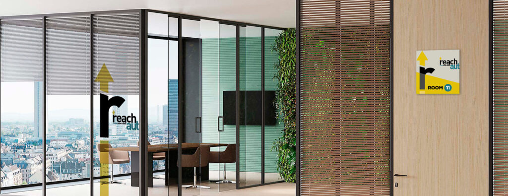
Our logo has been updated, with an upward arrow as our new symbol to express our vision of health as a destination we’re heading to, and at the same time to convey an uplifting, optimistic message: by working on our health we “go up”, we become better, we ascend.